
How to work with Assessment/Reassessment Graphs
This guide offers essential insights into utilizing Assessment and Reassessment graphs effectively, enhancing your ability to document and analyze behavioral progress. By allowing the addition of multiple graphs for each behavior or skill, it provides flexibility in showcasing trends and supporting clinical recommendations. The customization options for date ranges, data display settings, and location filters enable tailored presentations that highlight key insights. Overall, this guide is a valuable resource for improving assessment documentation and analysis.
In Assessments and Reassessments, the system generates graphs based on the selected treatment period by default. However, you can add additional graphs with customized configurations for each behavior, replacement behavior, or skill to meet the needs of each case.
This provides greater flexibility when documenting progress, comparing performance across settings, and identifying trends that support clinical recommendations.
Add a Graph
1. Go to the corresponding section:
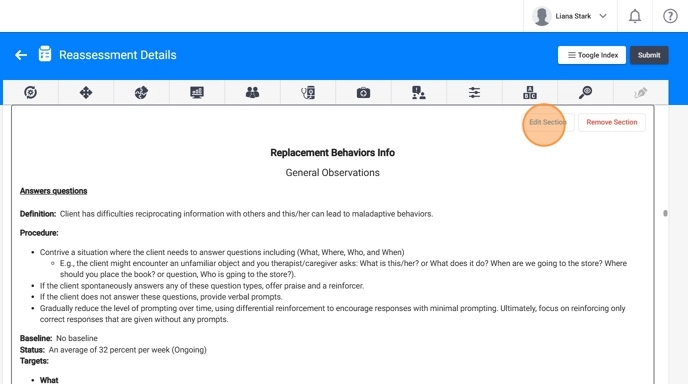
- Maladaptive Behaviors Info
- Replacement Behaviors Info
- Skill Acquisition Info
- Click Edit Section.
- Select Add Graph
You may add as many graphs as needed for that specific behavior or skill.
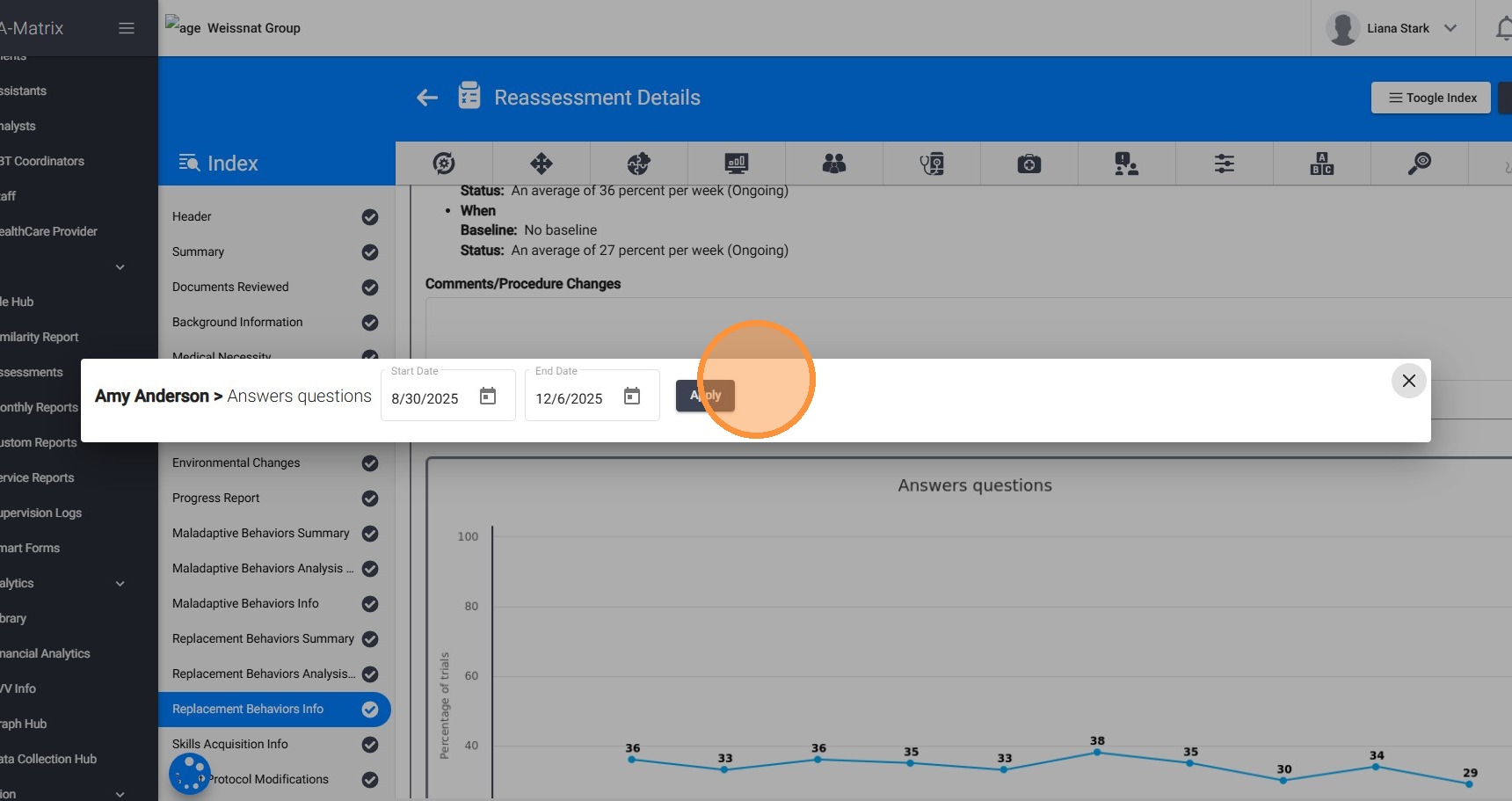
Set the Date Range
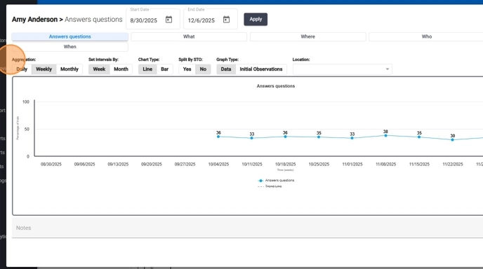
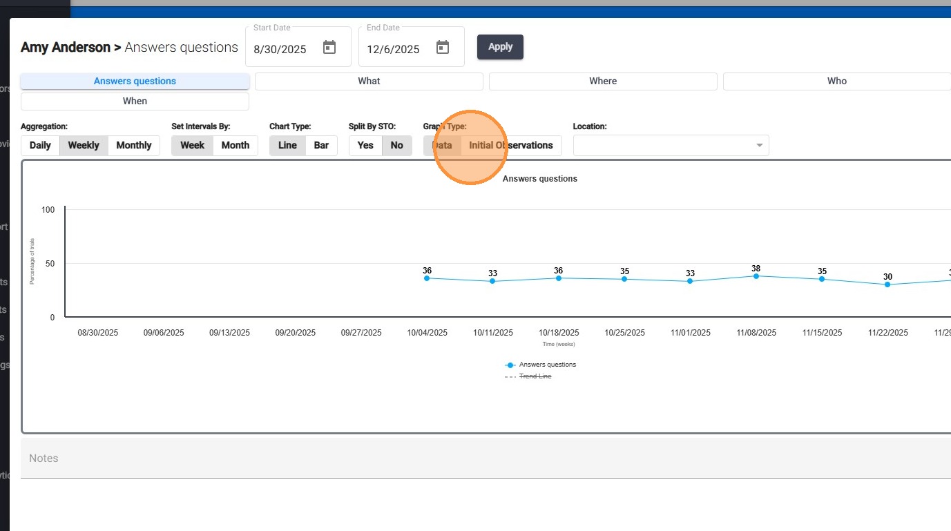
2. Before adding a graph to the report, you can customize how the data is displayed using several filter options. These options allow you to tailor each graph to highlight the specific trends or insights you want to communicate.
- Date Range: Define the exact timeframe you want the graph to cover so the visual aligns with the assessment period or the analysis you are presenting.
Configure Data Display Settings
3. Aggregation: Choose daily, weekly, or monthly grouping to emphasize either short-term changes or long-term progress.
- Intervals: Select whether the graph displays data in weekly or monthly intervals, helping you control how the timeline is segmented.
- Chart Type: Select a line or bar graph
Select the Graph Type
4. Choose whether to display:
- Standard Data (baseline + ongoing performance) or
- Initial Observations only.
This allows you to include both the initial observation graph and the ongoing data graph within the same report for clearer comparison.
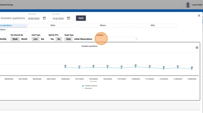
Apply Location Filters
5. Location Filter: Display data from all locations or narrow it down to one place of service, such as: Home, School, Clinic, or Community. This is especially useful for discussing generalization or setting-specific differences.
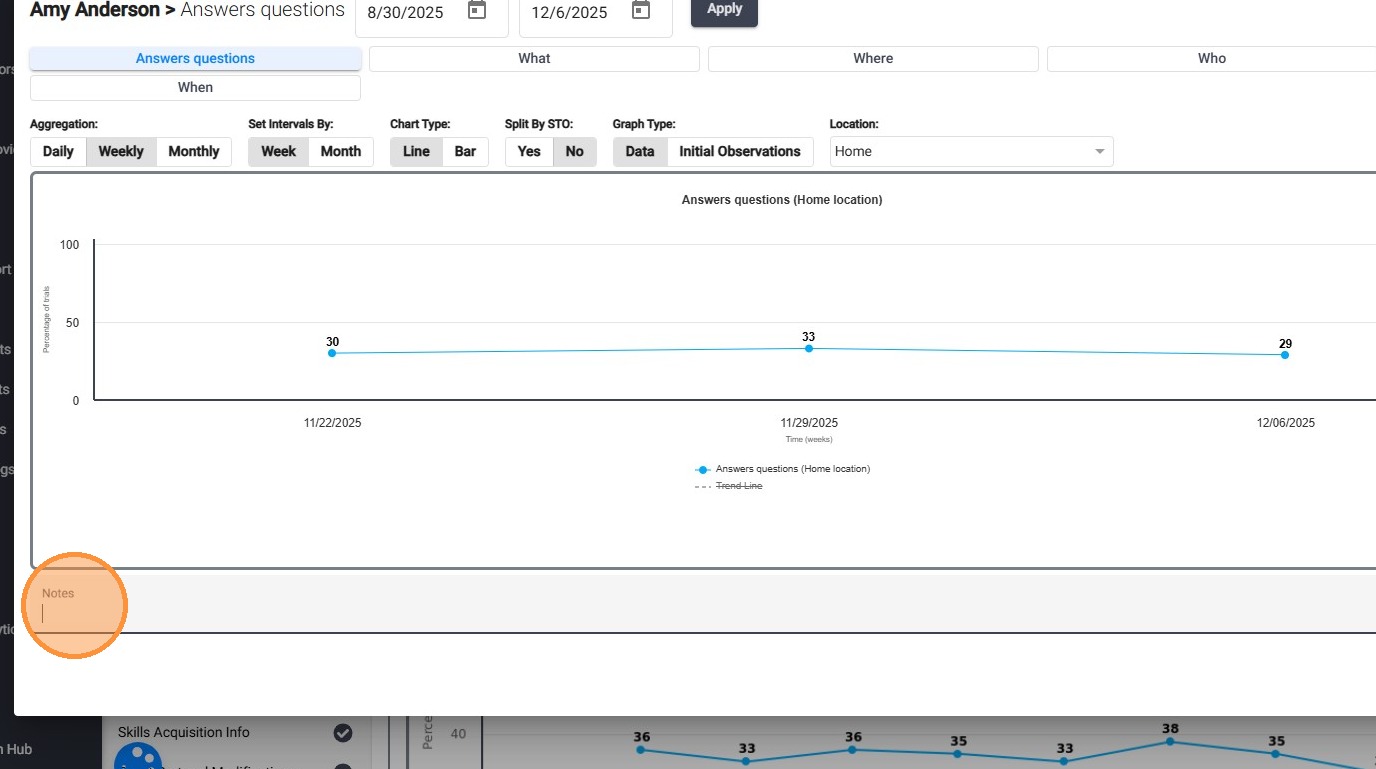
Add Notes
6. You can also add notes at the bottom of each graph, providing space for a brief explanation or clinical interpretation to support your findings.
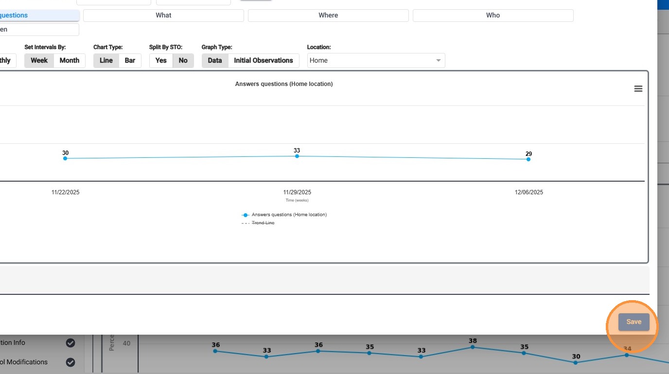
7. Click Save to add the new graph
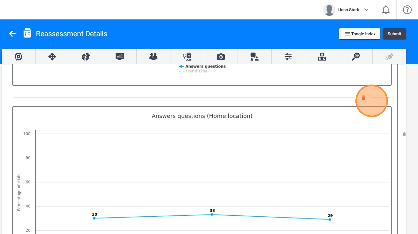
Delete a Graph
8. If needed, you can delete any graph you do not want to include in the final report.
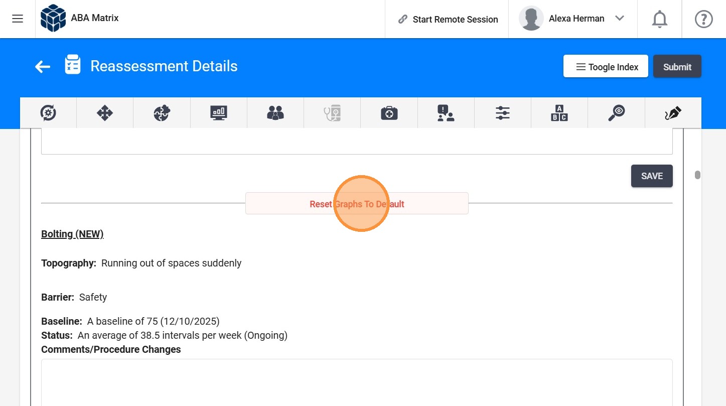
Reset Graphs to Default
9. Click on "Reset Graphs To Default"
This will remove all added graphs and restore the default graphs.
10. To reset the graphs:
- Click on "Reset"
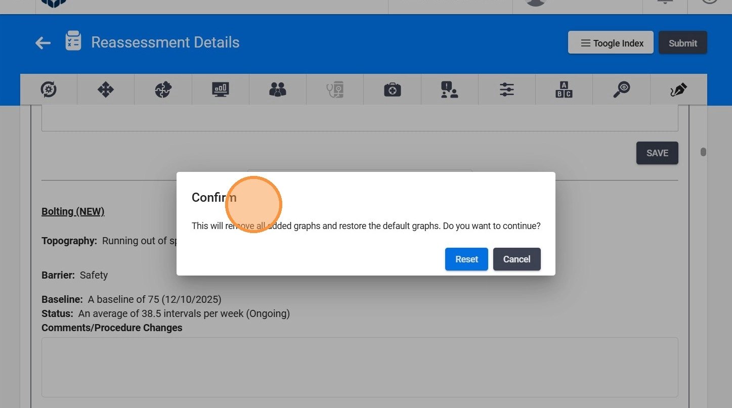
Any custom graphs you added will be removed, and only one graph per behavior will be displayed, as it was originally set when the report was first created.