How to use the Graph Hub Tool in ABA Matrix
Graph Hub in ABA Matrix is a powerful tool for applied behavior analysis. It allows for detailed visualization of intervention data and customization of graphs according to the specific needs of the analyst. This guide provides detailed instructions on how to use the various features of Graph Hub.
1. Accessing the Graph Hub Tool
1. To access the Graph Hub Tool, there are two ways to do it:
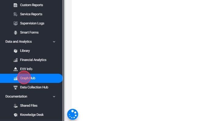
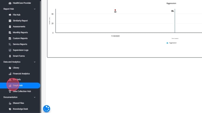
1- From the index panel located on the right side of the window.
2. 2. Or from the blue, round tool icon at the bottom of the page.

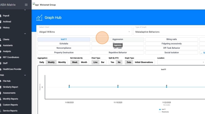
3. Select Client, Category, and Date Range:
- Choose the name of the client from the dropdown list.
- Select the type of graph you wish to view: behavior, skill, competency, etc
- Select the desired date range for the data you want to analyze.
- Once you have entered the necessary information, click the "Apply" button to generate the graph.
4. Select the graph you wish to analyze.
2. Graph Configurations
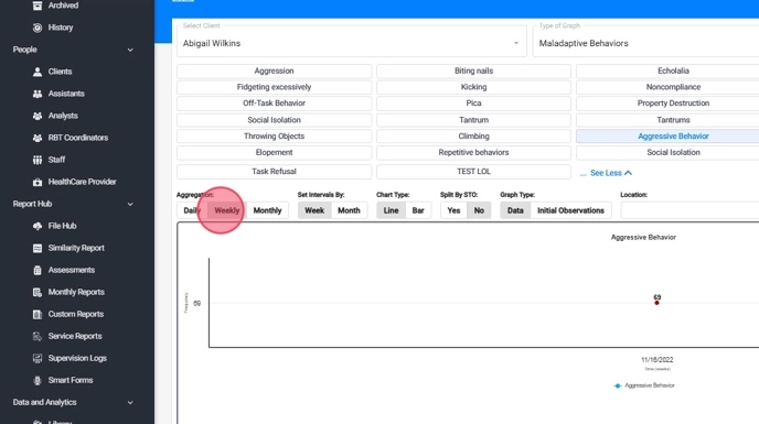
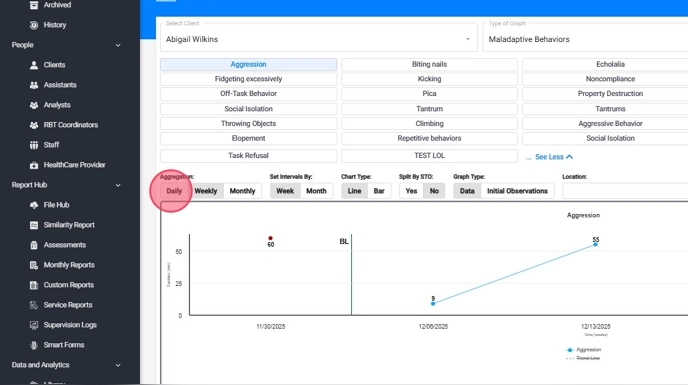
5. - Aggregation: refers to how the data points are summarized for the graph, whether on a daily, weekly, or monthly basis.
- Intervals: refer to the time periods over which the data is displayed, such as by day, week, or month.
- Chart Type: it can be lines or bars.
Here’s how it works:
- If you choose weekly aggregation with a monthly interval, the graph will display the weekly average data for each month. This means you'll see one data point with the weekly average for each month.
- If you choose daily aggregation with a weekly interval, the graph will show the daily average data for each week. In this case, you'll see one data point with the daily average for each week.
- This allows you to customize how data is represented based on your specific needs for analysis and reporting.
2.1 Graph Type Filter
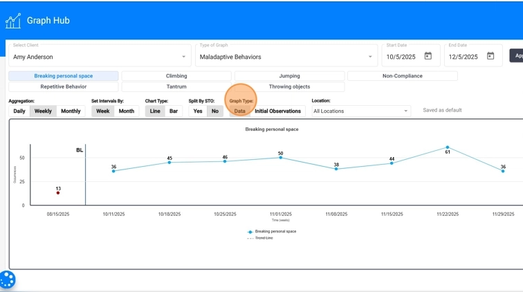
6. In addition to standard display options, users can choose between two graph types:
- Data: Displays baselines and all ongoing session data.
- Initial Observations: Displays all initial observation points added to the program or target, helping clinicians compare early performance to current progress.
This allows for more detailed pre- and post-analysis and helps teams visualize skill growth from the earliest stages of instruction.
2.2 Location Filter
7. The Location filter allows users to view progress by specific place of service. This filter is available across all graph types and supports clearer analysis of how behaviors or skills vary across settings such as:
- Home
- School
- Clinic
- Community
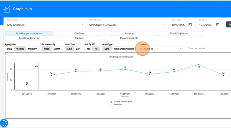
8. Users can choose to view combined data for all locations or isolate performance for a single environment. This is especially useful for evaluating generalization, identifying setting-specific challenges, and making data-driven treatment decisions.

2.3. How to change the default Graph View
9. By default, graphs will have the following configuration:
- Aggregation: Weekly.
- Intervals: By Week.
- Chart Type: Line for Behaviors/Replacements, Bar for Competencies.
Which means that we calculate the weekly totals (Behaviors, Skills, Competencies), and then we graph that value in a line or bar, depending on the configuration.
10. To change the default configuration, go to the Graph Management Tool or the Graph Hub, adjust the graph settings to your preference, and then click Save as Default.
Here’s how it works:
- If you choose weekly aggregation with a monthly interval, the graph will display the weekly average data for each month. This means you'll see one data point with the weekly average for each month.
- If you choose daily aggregation with a weekly interval, the graph will show the daily average data for each week. In this case, you'll see one data point with the daily average for each week.
This allows you to customize how data is represented based on your specific needs for analysis and reporting.
Notice that Save as Default is grayed out, and it will stay that way until you make a change to the configuration.
Be aware that if you change the default graph view, the new configuration will apply everywhere the graph is displayed, including monthly reports and assessments/reassessments.
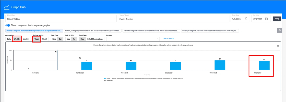
11. In the case of competencies, changing the default graph view can have desired consequences. For example, lets take a look at the next case:
Notice how in this example, the aggregation of the data weekly by week, is causing the value of a competency to be graphed on April 4th (last day of the week). This means that the competency wont show in the client's May monthly.
12. If you change the default graph type to daily by day for example, you will be able to see the exact day the competency took place, placing the data in the graph in the correct month, hence the client's May monthly, will include the competency:
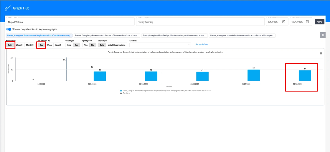
This configuration is desired for Caregiver and RBT Competencies, since they occur less frequently, and most of the time, take place at the end of the month.
3. Tools
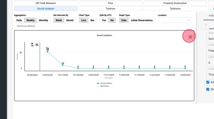
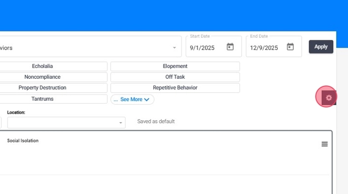
13. The Graph Hub tool in ABA Matrix is designed to provide a detailed and customizable view of your client's data. One of the essential features for tailoring your graphs to specific needs is the tool icon, which allows for a range of configuration options. This icon is your gateway to adjusting various settings to enhance the clarity and relevance of your visual data.
- Clicking on the tool icon will open a sidebar tab that includes features of the graph that can be configured and changed for an individual graph or for all graphs.
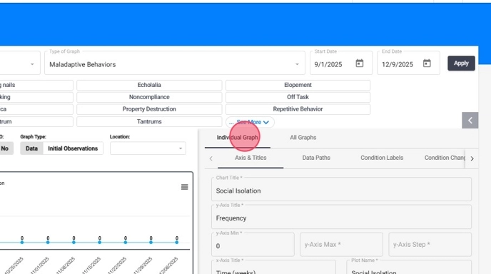
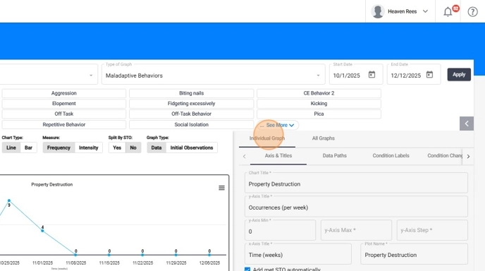
3.1. Adding or modifying the Title of an individual graph
14. - In the graph's settings menu, look for the "Chat Title" option.
- Enter the desired title for your graph.
- Click "Apply" to save the changes.
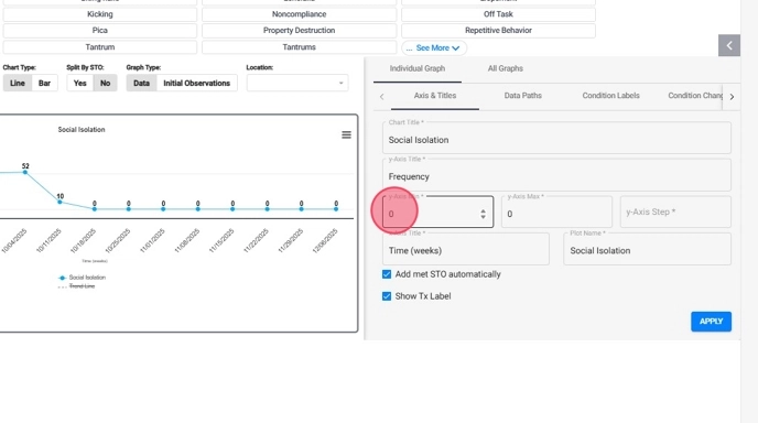
3.2. Customizable Y-Axis Parameters for an Individual Graph
Users have the ability to set the maximum and minimum values of the Y-axis on graphs. This customization allows for better control over the display of data, ensuring that visual representations accurately reflect the range and scale of observed behaviors or outcomes.
15. From the "y-Axis Max" (the highest data point shown in the graph) and the "y-Axis Min" (the lowest data point shown in the graph) fields you can adjust the Y-axis parameters according to your preferences and click "APPLY" to see the changes.
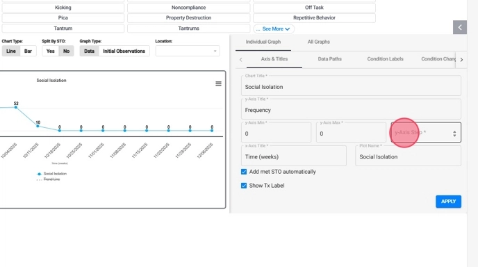
3.3. Adjustable Steps on the Y-Axis for an Individual Graph
You can specify the desired intervals or steps for the Y-axis, providing finer granularity in graph presentations. This feature enhances the precision and clarity of data visualization, enabling more nuanced analyses and interpretations.
16. Click the "y-Axis Step" field and specify the desired step size for the Y-axis and click "APPLY"
4. How to Add and Modify Data Paths, Condition Change Lines, and Condition Label
In ABA Matrix, there are key differences between data paths, condition change lines, and condition labels:
Data Paths
- Definition: Data paths are the connections between two data points in the system, visually representing progress or outcomes over time in a graph.
- Function: Illustrate the changes in behavior or skills by connecting data points collected during different sessions.
- Use: Employed to monitor and analyze a client's progress over time.
- Example: A line connecting data points to show the frequency of a specific behavior across multiple sessions.
Condition Change Lines
- Definition: Lines indicating a change in condition or treatment on the graph.
- Function: Visually mark points in time where a significant change in treatment or the client's environment occurred.
- Use: Used to correlate changes in data with modifications in treatment.
- Example: A vertical line marking the start of a new treatment protocol.
Condition Labels
- Definition: Labels describing the conditions under which the data was collected in the graph.
- Function: Provide additional context about the environment or circumstances of treatment during a specific period.
- Use: Used to offer a textual description of conditions and changes over time.
- Example: A label indicating "Switch to Protocol B" to explain a change in behavior on the graph.
These tools together allow for a detailed and contextualized understanding of behavioral data in ABA Matrix, facilitating analysis and decision-making in treatment.
4.1. Individual Graph
4.1.1. How to add data paths
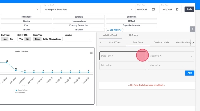
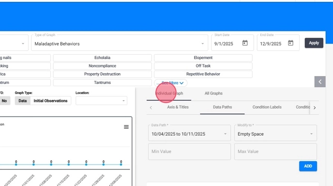
17. Go to the "Individual Graph" button, as shown in the image, and then select the "Data Paths" option.
With this option, you can create changes in the data line on the graph to highlight any important features you want to emphasize.

18. In the following options, you will need to select:
- Date range you want to change
- Style in which it will appear
- Discontinued line
- Empty space
19. Once you have filled out the necessary fields, press the "Add" button, as shown in the image.
You will notice that in the graph on the left, there will be an interruption in the continuous line of data on the desired date.
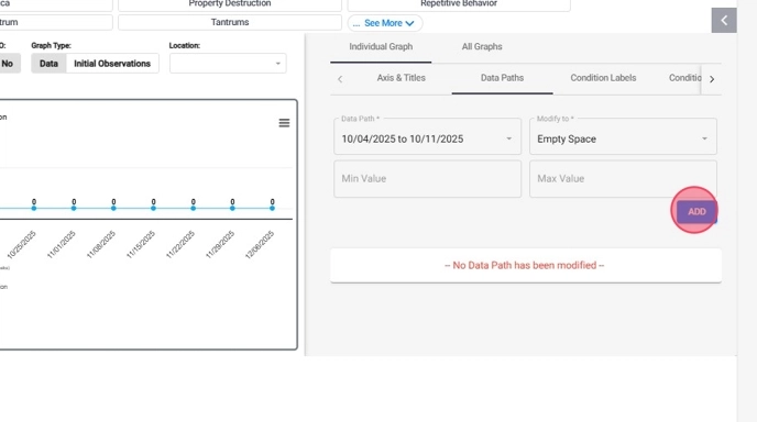
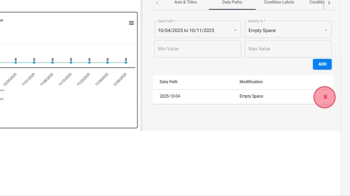
20. At the bottom of the settings tab, you will see all the changes included in the graph.
If you want to delete it, just select the option represented by a trash can.
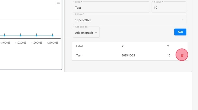
4.1.2. How to add a "Condition Label"
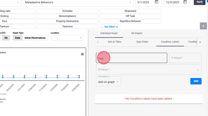
21. Go to the Individual Graph -> Condition Labels section
22. From the "Condition Label" screen, fill the required fields:
- Label: The text to be shown in the graph
- Y- Value: Height of the label on the graph
- X -Value: Date the label will be shown
- Then click on Add
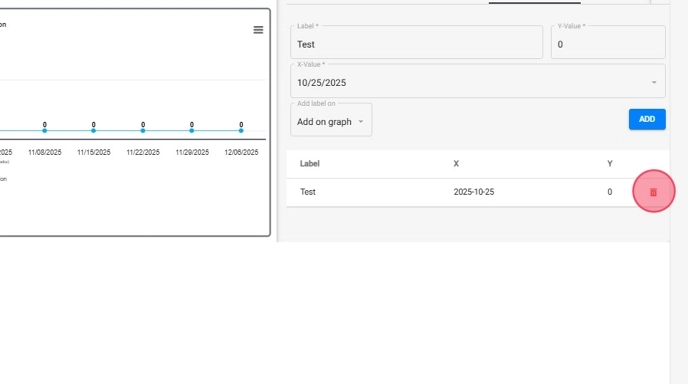
23. Once the "Condition Label" has been added, you should see it in the graph as shown in the following image:

24. At the bottom of the settings tab, you will see all the changes included in the graph.
If you want to delete it, just select the option represented by a trash can.
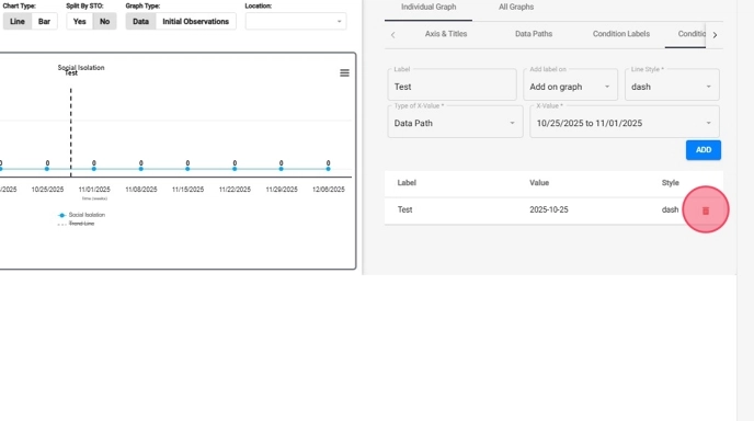
4.1.3. How to add "Condition Change lines"
25. Go to the "Individual Graph" button. Then press the button until you reach the "Condition change lines" option.
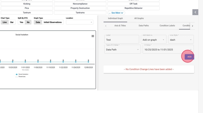
26. You need to complete the options provided for the label:
- Label: Enter the name that will represent the label.
- Add Label On: Choose where the condition change line will appear:
- either on the graph itself or
- in the legend at the end of the graph for easy reference.
- Line Style: Select the style of the line:
- Solid
- Dash
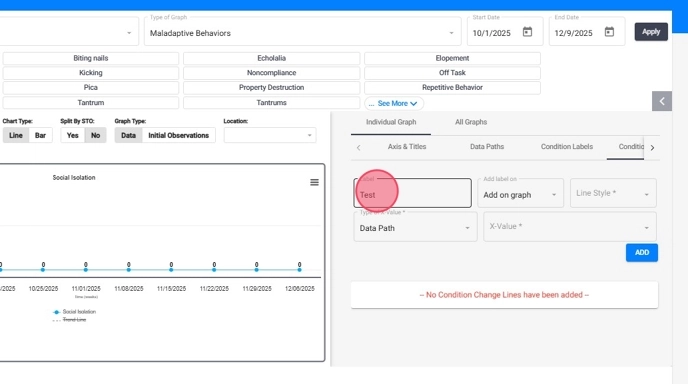
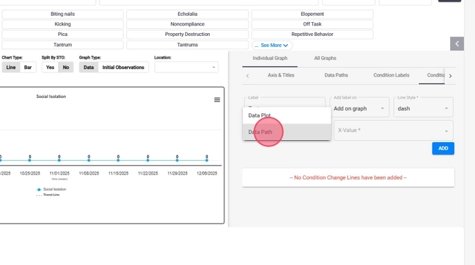
27. In the following section, you can configure the X-axis, the Type of Value:
- Data Path: A range of dates, used to display a condition change line between two data points.
- Data Point: A single specific date.
28. Once all the features are completed, press the "add" button located at the bottom right of the screen.
You will see in the graph on your left that a line will appear labeled with the features that were included, as shown in the image. In this example, the graph will show us that on the indicated date, a new RBT began working with the client.
29. At the bottom of the settings tab you can see all the changes included in the graph.
If you want to delete it, just select the option represented by a trash can.
This way you can include in the graph any changes in condition while working with the client.
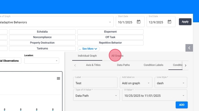
4.2. All Graphs
Users can add Data Paths, Condition Change Lines, and Condition Labels to all graphs simultaneously. This enhancement simplifies the process of annotating graphs with significant events or interventions.
4.2.1. How to add "Data Paths" (All Graphs)
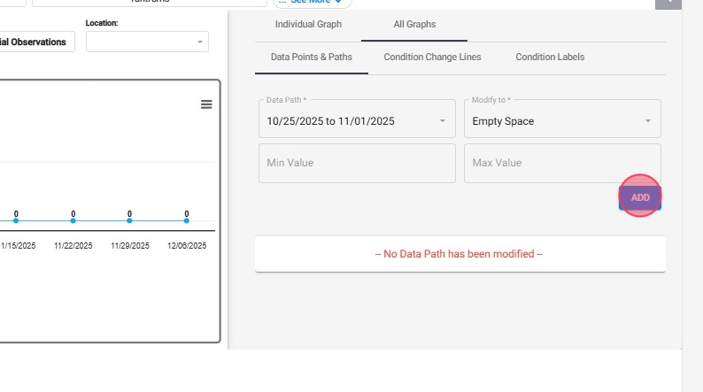
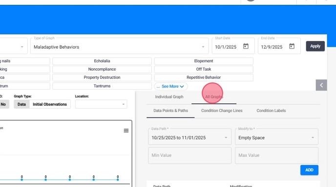
30. Go to the "All Graph" button, as shown in the image, and then choose the "Data Paths" option.
With this option, you can create changes in the data line of all the graphs to highlight some important feature that you want to make known.
31. In the following options, you will need to indicate the date range you want to indicate and the style in which it will appear.
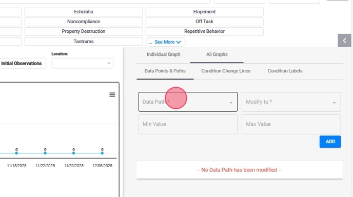
In ABA Matrix, setting the minimum and maximum values for a data path ensures a consistent range across all graphs. Here's a brief explanation:
Minimum and Maximum Values in a Data Path
- Minimum Value:
- Definition: The lowest data point shown in the graph.
- Function: Excludes data below this value.
-
Uniformity: Ensures all graphs start from the same baseline for accurate comparison.
Maximum Value:
- Definition: The highest data point shown in the graph.
- Function: Excludes data above this value.
- Uniformity: Ensures all graphs display data up to this point for consistent analysis.
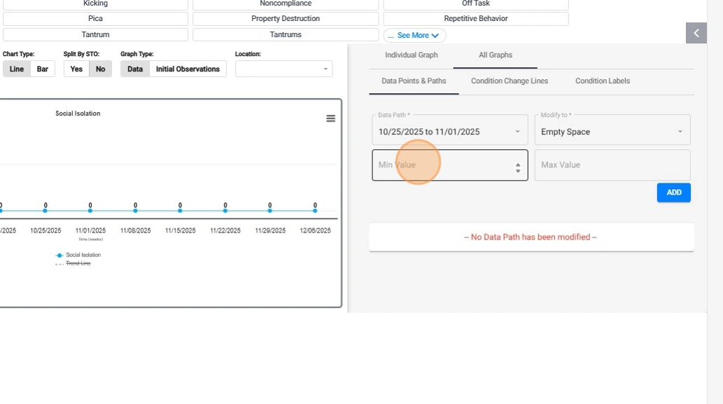
32. Once you have filled out the necessary fields, press the "Add" button, as shown in the image. You will notice that in the graph on the left there will be an interruption in the continuous line of data on the desired date.
4.2.2. Condition Change Lines (All Graphs)
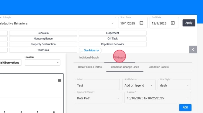
33. Go to All Graphs and select the Condition Change Lines tab
34. Add the "Label", select the Line Style and the Type of X Value. Then click "ADD"
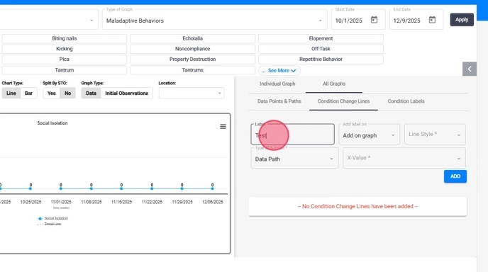
35. That way you will be adding the condition change line to all graphs at once

36. Additionally, these condition change lines can be included in the legend at the end of the graph for easy reference. Just select "Add on Legend" instead of Add on graph and click "ADD"
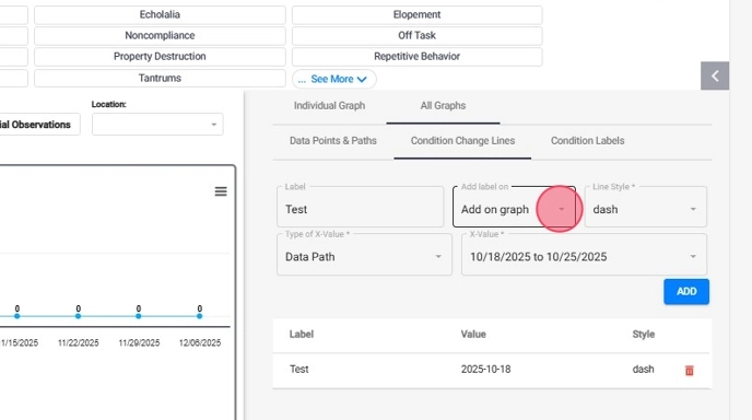
37. Then the condition change line will be added to the graph legend

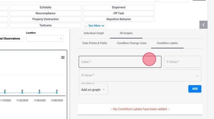
4.2.3. Condition Labels (All Graphs)
38. Go to the "Condition labels" option:
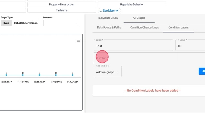
39. A window will open with fields you need to fill in. You will need to name the tag and the value where you want the tag to appear, as shown in the image.
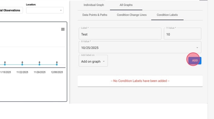
40. Select the date where the label will appear.
41. Once all the fields have been included, the "add" button located at the bottom of the window will be activated. You must press it, and you will see how your label will appear in the graph on the left of the screen with the value indicated above and the desired date.
42. At the bottom of the settings tab you can see all the changes included in the graph. If you want to delete it, just select the option represented by a trash can, as shown in the image.
5. How to Download a Graph Image in ABA Matrix
43. From Graph Hub, you can view the graph in full screen, print it, or download it in various image formats for your records or presentations.
- Click on the hamburger icon (three horizontal lines) located in the upper right corner of the graph.
- From the dropdown menu, choose the option to Print or Download.